
If you’ve just started learning Forex trading, you’ve probably noticed that almost every trader uses candlestick charts.
There’s a good reason for that.
A candlestick chart tells you far more than a simple line chart ever could. It shows the battle between buyers and sellers, reveals market sentiment, and helps traders spot repeatable patterns that can lead to trading opportunities.
The best part?
Once you understand how to read a single candlestick, the rest becomes much easier.
Let’s start with the basics.
What Is a Candlestick Chart?
A candlestick chart is a way of displaying price movement over a set period of time.
Each candlestick represents one complete trading period.
That period depends on the chart you’re using.
For example:
- On a 1-hour chart, each candlestick represents one hour of trading.
- On a 15-minute chart, each candlestick represents fifteen minutes.
- On a Daily chart, each candlestick represents one full trading day.
As one candle closes, the next one begins.
Together, they tell the story of what buyers and sellers have been doing over time.
What Does One Candlestick Show?
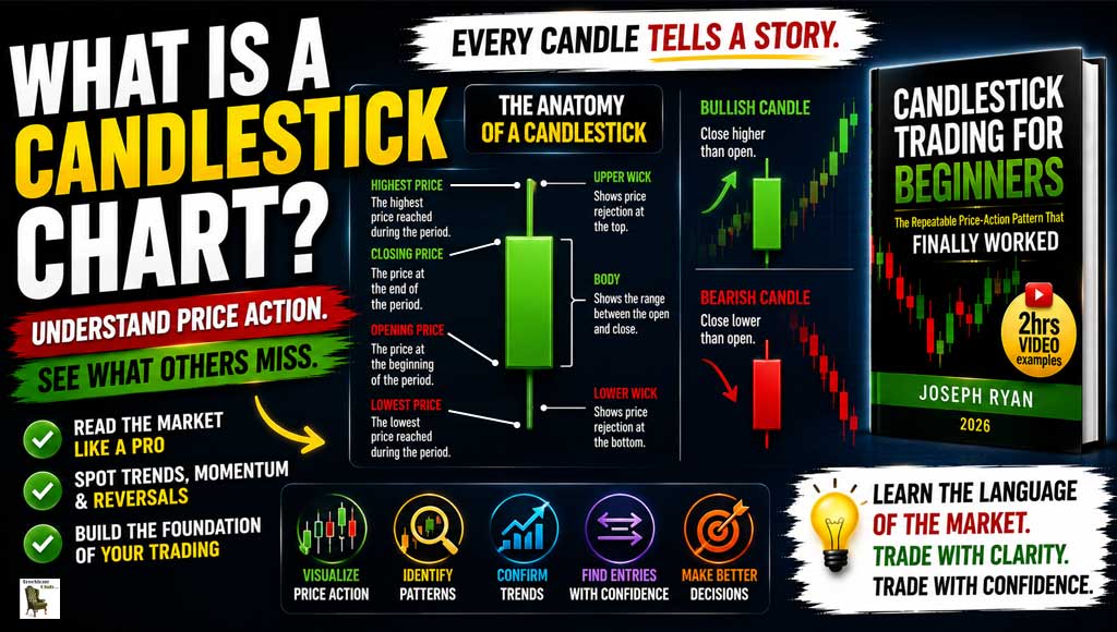
Every candlestick contains four important pieces of information.
Opening Price
The price where the trading period began.
Closing Price
The price where the trading period ended.
Highest Price
The highest point reached during that trading period.
Lowest Price
The lowest point reached during that trading period.
Those four prices are all you need to build a candlestick.
Understanding the Parts of a Candlestick
Every candlestick has two main parts.
The Body
The thick section of the candle is called the body.
It shows the difference between the opening and closing prices.
A long body usually means there was strong buying or selling during that period.
A short body suggests the market was more balanced.
The Wicks
The thin lines above and below the body are called wicks (sometimes called shadows).
They show how far price travelled before returning.
Long wicks often tell us there was a battle between buyers and sellers.
Sometimes they can even hint that momentum is beginning to fade.
Bullish vs Bearish Candles
Most charting platforms use two colours.
Bullish Candle
Usually green.
The closing price is higher than the opening price.
Buyers were in control.
Bearish Candle
Usually red.
The closing price is lower than the opening price.
Sellers were in control.
Looking at a single candle doesn’t tell the whole story.
Looking at many candles together begins to reveal trends and patterns.
Why Candlestick Charts Are So Popular
Candlestick charts make it easier to understand market behaviour.
Instead of seeing only a line moving up and down, you can instantly spot:
- Strong buying pressure
- Strong selling pressure
- Momentum slowing
- Areas of hesitation
- Potential reversals
- Trends developing
That’s why nearly every price-action trader uses them.
Candlesticks Tell a Story
Think of each candle as one sentence.
One candle by itself doesn’t tell you much.
But dozens of candles together create a story.
You begin to see:
- Buyers taking control.
- Sellers pushing back.
- Momentum building.
- Momentum fading.
- Markets preparing to reverse.
Learning to read that story is far more valuable than memorising dozens of indicators.
How I Use Candlestick Charts
I don’t try to memorise every candlestick pattern ever invented.
Instead, I focus on simple price action.
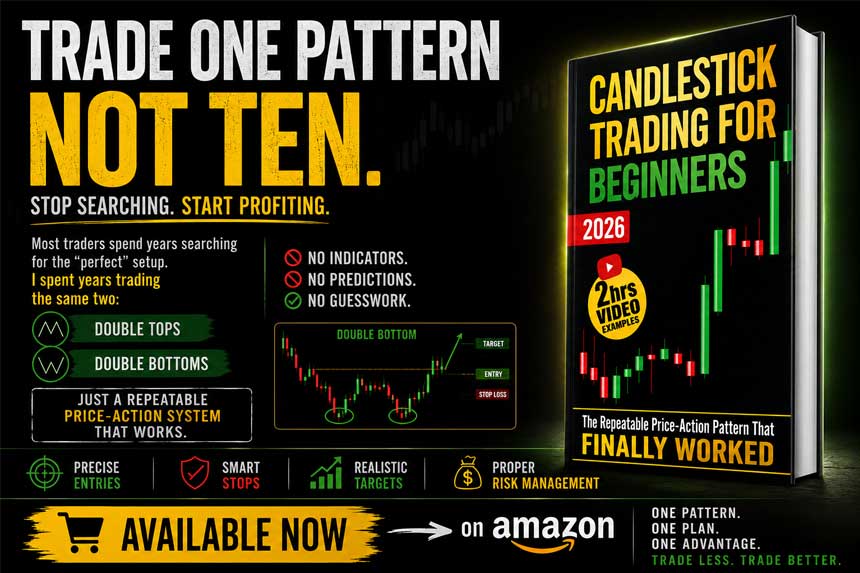
My trading revolves around just two chart patterns:
- Double Tops
- Double Bottoms
Candlesticks help me identify:
- The final strong candle before a reversal.
- The boxed area that defines the setup.
- The neckline.
- The confirmation before placing a pending order.
Without candlestick charts, that process wouldn’t be possible.
Common Beginner Mistakes
Looking at One Candle in Isolation
A single candle rarely tells the whole story.
Always look at what happened before it.
Ignoring the Trend
Candles make much more sense when viewed within the overall market direction.
Filling Charts With Indicators
Many beginners cover their charts with indicators and end up ignoring the price itself.
Price comes first.
Everything else is secondary.
Trying to Learn Every Pattern
There are dozens of named candlestick patterns.
You don’t need to know them all.
Start by understanding how candles behave, then learn one trading strategy well.
Why I Prefer the 1-Hour Chart
Candlestick charts work on every timeframe.
Personally, I prefer the 1-hour chart.
It provides:
- Cleaner market structure.
- Less noise.
- Clearer Double Top and Double Bottom formations.
- Enough time to analyse trades without feeling rushed.
It’s a great balance for traders who want a calm, mechanical approach.
Want to Learn How I Use Candlestick Charts?
Understanding candlesticks is the first step.
Knowing how to use them as part of a complete trading strategy is the next.
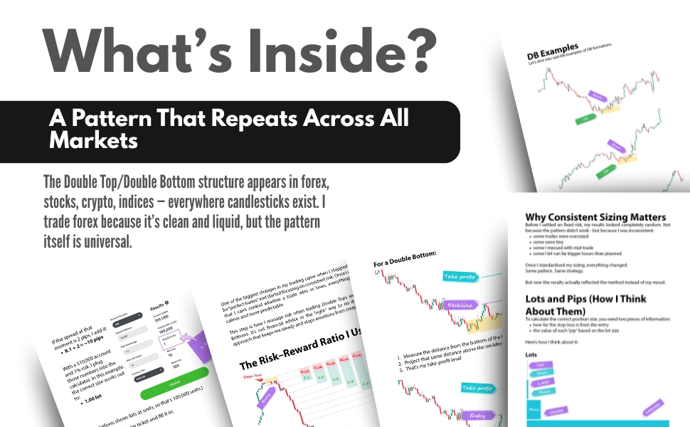
In Candlestick Trading for Beginners, I explain the exact process I use to trade with candlestick charts, including:
✔ How I identify Double Tops and Double Bottoms
✔ The box method for qualifying setups
✔ Entry rules using pending orders
✔ Fixed stop-loss and take-profit placement
✔ Risk management using the 1% Rule
✔ Daily routines that help remove emotion from trading
If you’re looking for a straightforward, beginner-friendly approach to price-action trading, it’s the perfect next step.
Check it out on Amazon.com
Check it out on Amazon.com
Final Thoughts
Candlestick charts aren’t complicated.
They’re simply a visual record of the battle between buyers and sellers.
Learn to understand that battle, and you’ll start seeing the market in a completely different way.
You don’t need dozens of indicators.
You don’t need hundreds of strategies.
You need to understand what price is telling you.
Master candlesticks first.
Everything else in trading becomes much easier from there.