
Candlestick charts are a fundamental tool in forex trading, providing visual insights into price movements and patterns. They help traders make informed decisions by displaying the opening, closing, high, and low prices within a specific time frame.
The 1-hour candlestick chart is the perfect balance of clarity, structure, and simplicity. It filters out the noise of the fast charts while still forming clean Double Tops and Double Bottoms throughout the day — the exact pattern I rely on in my own trading.
This time frame gives me enough structure to plan trades calmly, place pending orders, and let the system run without constant screen-watching. If you like a mechanical, rule-based approach, the 1-hour chart is one of the easiest places to spot and trade repeatable patterns.
Below, I’ll walk you through the advantages of the 1-hour chart and how it fits perfectly with a straightforward DT/DB strategy.
Advantages of the 1-Hour Chart
1. A Clearer, Cleaner View of Price
Lower time frames — like the 1-minute or 5-minute charts — are noisy. Price whips around, spreads matter more, and the candles can be erratic.
The 1-hour chart smooths all of that out.
You see the actual structure forming:
- the last strong candle
- the consolidation
- the boxed area
- the neckline
- the re-entry
- the break
This clarity is exactly what you want when trading a pattern that depends on structure rather than indicators.
2. Less Noise, Fewer False Signals
Most false moves happen on the lower time frames. The 1-hour chart filters these out so you’re not reacting to every flicker of price.
For a pattern-based trader, that means:
- fewer fake DT/DBs
- cleaner necklines
- stronger re-entries into the box
- easier validation of setup quality
This leads to more consistent decisions and fewer impulses.
3. More Setups Than Higher Time Frames
The 4-hour and daily charts form beautiful patterns — but far too slowly for a day trader.
The 1-hour chart strikes a nice balance:
- clean price action
- enough setups each week to stay active
- enough time to plan trades calmly
- no need for constant monitoring
Patterns form often enough to make a mechanical strategy practical.
4. Perfect Fit for a Mechanical Style
I trade with pending orders:
- A sell-stop below the neckline for a Double Top
- A buy-stop above the neckline for a Double Bottom
Once the order is set, everything runs on autopilot.
The 1-hour chart is ideal for this because the structure builds slowly and predictably.
There’s no need to chase trades, no rapid decision-making, and no glued-to-the-screen stress.
5. Ideal for Busy Traders
You don’t need to sit at the charts all day.
On the 1-hour chart you can:
- check the charts
- mark potential patterns
- place pending orders
- walk away
Once the setup is identified and the order is placed, your job is done.
Because nothing is held overnight, everything resets at London close — clean and simple.
Tips for Trading the 1-Hour Chart (Aligned With My DT/DB Method)
1. Follow a Simple, Written Plan
Your plan should outline:
- the pattern you trade (DT/DB)
- how you validate it
- where you place entries and stops
- your risk (1% per trade)
- your daily routine
- when you stop trading
A written plan removes impulse and keeps everything mechanical.
2. Use Mechanical Risk Management
For this strategy, stop-loss and take-profit placement is always the same:
- DT: stop-loss goes above the box
- DB: stop-loss goes below the box
- Take-profit is always 1:1, measured from box to neckline
No support/resistance stops.
No adjusting mid-trade.
No improvising.
Just clean, repeatable rules.
3. Avoid Trading Through News
Big news releases can destroy a perfectly good pattern.
Best practice:
- avoid trading into news
- avoid holding into news
- delete pending orders if news is close
Staying out of trouble is just as important as finding setups.
4. Close Everything by London Close
This is a day-trading method.
I close all trades — win or lose — by London close.
Why?
- spreads widen
- liquidity thins out
- price often becomes erratic
- there is no benefit to staying in
Ending the day flat keeps the method clean and stress-free.
5. Keep a Journal
This doesn’t need to be complicated.
Track:
- pattern quality
- entry and exit
- distance to stop
- position size
- whether you followed the rules
- any interference
- how you felt
Journaling reveals patterns in your behaviour, not just the charts.
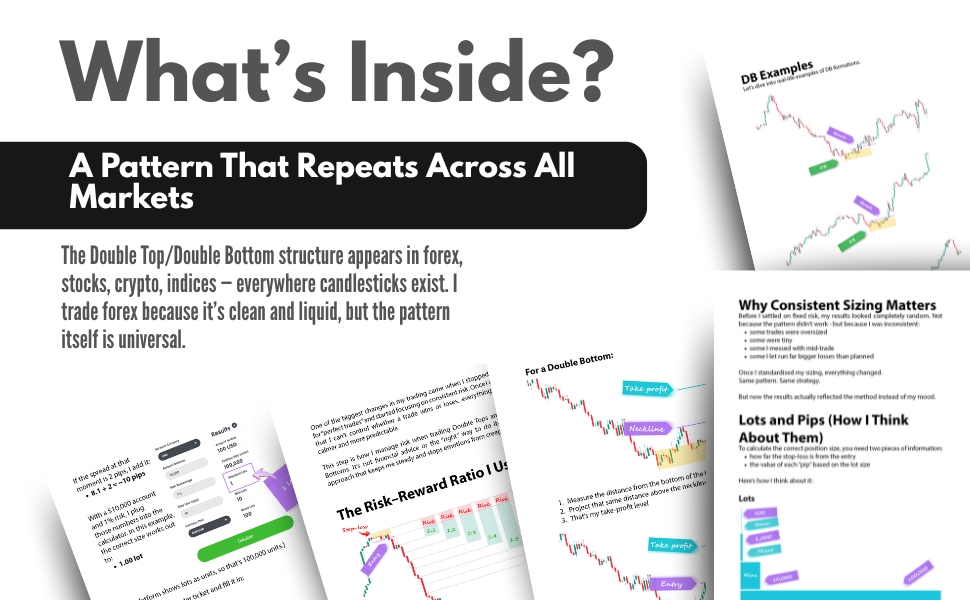
Example: DT/DB on the 1-Hour Chart
Double Top
A DT forms after an upward move.
You box the last strong green candle, wait for the drop, wait for price to re-enter at least halfway, and mark the neckline.
A sell-stop goes below the neckline.
Double Bottom
Same idea, opposite direction.
You box the last strong red candle at the bottom, wait for the climb, wait for re-entry, mark the neckline, and place the buy-stop above it.
These simple, repeatable structures appear consistently on the 1-hour chart.
Check it out on Amazon.com
Check it out on Amazon.com
Final Thoughts
If you prefer a calm, structured, mechanical way to trade — without indicators, forecasting, or guesswork — the 1-hour chart is one of the best places to apply it. You get:
- cleaner patterns
- fewer fakeouts
- enough time to think
- minimal stress
- setups you can plan and walk away from
It’s a perfect fit for the Double Top/Double Bottom method I use each day.
If you’d like to go deeper into the strategy — including how I place trades, manage risk, and handle the mental side — you can download my ebook below.
Examples of Successful Trades Using the 1-Hour Chart
Explanation and Chart Example: The double top and double bottom patterns are classic chart formations that signal potential reversals in the market. A double-top pattern is formed when the price peaks twice at roughly the same level, indicating resistance, while a double-bottom pattern forms when the price bottoms twice at a similar level, indicating support.
- Double Top Example: On the 1-hour chart, a currency pair might show two peaks around the same price level, with a subsequent decline between them forming a valley we call the neckline. Once the price breaks below the neckline level, it often indicates a bearish reversal.
- Double Bottom Example: Conversely, a double bottom pattern on the 1-hour chart may appear as two troughs at the same price level, with a peak in between we call the neckline. Once the price breaks above the neckline, it signals a bullish reversal.
Entry, Exit, and Outcome Analysis:
- Entry: For a double top, enter a sell position when the price breaks below the neckline. For a double bottom, enter a buy position when the price breaks above the neckline.
- Exit: Set your take-profit level based on the height of the pattern. For a double top, target a price equal to the distance from the top of the pattern to the support level. For a double bottom, aim for a price equal to the distance from the bottom of the pattern to the resistance level.